memdaily app | UX case study


Overview
memdaily is a daily memory app that stimulates students’ brains to improve focus in class.
Role: UX Designer
Timeline: 14 weeks
Approach: User-Centered Design
Tools: Adobe XD
Challenge: Many students struggle to stay alert in morning classes. This app helps stimulate their brains beforehand, making it easier to stay focused and engaged.
Competitor Analysis
We began by analyzing two of the most popular memory apps to understand what’s currently available in the market.
Braindom App
When analyzing the Braindom app, we identified several pain points, including a generic progression system, frequent and distracting ads, and an inconsistent visual theme.
However, we also found strengths worth incorporating into our design, such as the app’s high learnability and efficiency.


Elevate App
When analyzing the Elevate app, the main pain points we noticed were the limited free features and the aggressive promotion of their subscription package, which we accidentally clicked on multiple times. Despite that, we found the app to be generally effective. It was easy to use, efficient, and we didn’t encounter many other issues during testing.


User Interviews
We interviewed six college students to better understand our users’ needs and preferences. These insights helped guide the direction of our project. Key takeaways included:
Simple Design – After reviewing competitors and gathering feedback, it became clear that a clean, minimal design was preferred. Since the game requires focus, unnecessary elements would only serve as distractions.
Challenging Gameplay – Users emphasized the importance of having games that adapt to individual skill levels. They wanted a level of difficulty that would keep the experience engaging and ensure their brains were truly being warmed up.
Additional Features – Participants expressed interest in features that enhance engagement and provide value beyond gameplay. Suggestions included an option to send results to friends and a page offering tips on improving brain health.
User Personas
Prototype
Low-Fidelity Prototype
We started with pen and paper prototypes, focusing on the home, start, game, and score page.

High-Fidelity Prototype
Our next step was developing a high-fidelity prototype using Adobe XD.
We gathered feedback from people within our user group, helping us make several design improvements. Key suggestions included adding an accent color to balance the heavy use of green, increasing text size for better readability, and reducing excess white space to make the layout feel more cohesive and engaging.
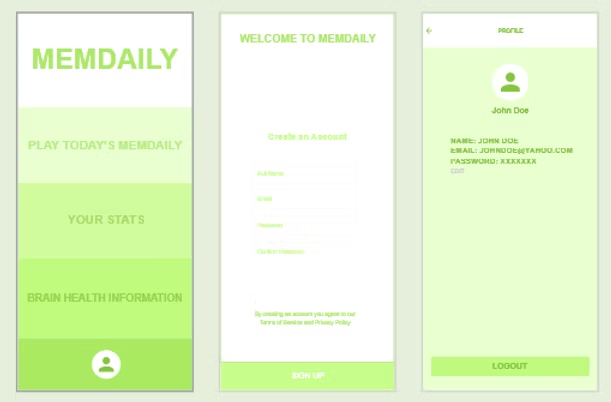
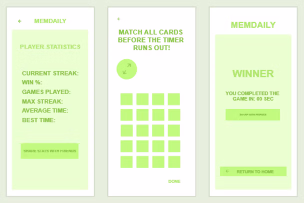
Final Project
The result of this process was a user-friendly app that is both engaging and functional.
The app features a timed, three-level card-matching game that increases in difficulty with each level. Users can share their results with friends and access helpful information on ways to support and improve brain health.
Overall, the app is designed to stimulate the brain and help users sharpen their focus—particularly useful before heading into morning classes. It also serves as an educational tool, offering tips for maintaining cognitive wellness.
Weeks later, I revisited the app and redesigned it based on final feedback from a UX instructor and my peers.
Here’s the final result:


